Thursday, March 29, 2012

5 Tips to Get You Started in iOS App Design

5 Tips to Get You Started in iOS App Design

To say that mobile is hot right now is an understatement. A recent study predicts that users of mobile devices will overtake users of PC’s by 2014. This means that within 2 years, more people will be consuming internet content through their mobile device than through their computer.

As a result, graphic designers that are knowledgeable in mobile app design are becoming more and more in demand. Here are 5 tips to get you started in iOS App Design.

1. Understand the basic resolutions for apple mobile devices:

There are basic resolutions that you need to remember for the newest versions of the iPhone and iPad3. You don’t want to be left in the dust with a design that doesn’t look crisp on the new version of the iPad.

Take note that even though the resolution for newer models have increased, files should still be saved at 72 DPI — just like any other web design.

iPhone:
  • App Icon: 114 x 114 pixels
  • App Store Icon: 512 x 512 pixels
  • Screen Size: 640 x 960 pixels
Set up Photoshop like this:

iPad:
  • App Icon 144 x 144 pixels
  • Store Icon 512 x 512 pixels
  • Screen Size 1536 x 2048 pixels

Set up Photoshop like this:


2. Start with a wireframe

Sketch a mock up that shows the basic outlines of your app. The more detailed you get, the better. This part of the process is all about visualizing how the user will interact and experience your app.

wireframe

When you are happy with your sketches, its time to turn them into digital wireframes in Photoshop.

Make sure to get all of your proportions correct. You don’t want a navigation bar that is narrow and appears crowded, but you also don’t want to use up the limited real estate you have available on a mobile device.

Maintaining consistent proportions throughout your interface is key to the app’s aesthetics and user experience. Check out some examples of digital wireframes here.

3. Start small and scale it bigger

Design for the iPhone first. By starting out with a design for iPhone, you will have less difficult decisions to make when you create the iPad version.

It’s easier to add elements, than to cut out elements the app needs. The best mobile designs are fully functional on the iPad and don’t feel like they lack features on the iPhone counterpart.

4. Provide the proper deliverables to your client/developer.

Like a web page, a layered .PSD file is the standard deliverable, however some developers may want you to slice the app into individual elements. All elements of the design should be saved in .PNG format — the preferred image file for iOS apps.

5. Use and Explore the iOS Dev Center

Apple has tons of resources available for app designers and developers in the iOS Dev Center. If you’re ever un-certain of best practices or any specific requirements for an App Design this should be the first place you go. The Human Interface guidelines section is especially useful for designers.

Have any questions or tips of your own? Leave them in the comments.


Source: http://99designs.com/designer-blog/2012/03/27/5-tips-to-get-you-started-in-ios-app-design/

Monday, March 19, 2012

5 Tips for Creating Hi-Res iPad Content


Xavier Facon is CTO at Crisp Media, a rich media advertising technology company based in New York City. He blogs regularly about ad technology and mobile best practices. Designers and developers who create content for mobile devices with high-resolution screens often see the retina display as both a blessing and a curse.


For instance, the new iPad, with its 2,048 x 1,536-pixel resolution, has a million more pixels than your 1080p HD television. But while the new resolution affords stunning, visual experiences, the devices often require 4G Internet speeds, which aren’t available to everyone. Furthermore, designers are questioning how to start multi-screen projects in the first place.
Whether publishing digital content or building rich media display advertising, try these five tips.


1. If Designing for Multiple Devices, Start with the iPad.


Although historically the order of creating digital content has been desktop first, smartphone second, tablet third, you will need to port experiences to all screens eventually. Therefore, reverse the order and start with the highest resolution screen and the most interactive platform.
Start with the iPad, the device that can handle the best interactive ingredients in terms of features and resolution. Then, revise the idea when porting to more limited devices, like desktops, smart TVs, smartphones and less advanced tablets. This ensures the content will be optimized to its fullest extent on every device.


2. Use Web Fonts.


Web fonts allow you to use almost any font without having to render it as an image first. Download the font separately and render the text in the browser using the @font-face feature. This saves a lot of bandwidth on high-resolution screens.


Combine the web fonts with shading and masks for high-res, customizable results. This font example looks like a hand-painted sign on your new iPad. Access these fonts from various vendors, like Typekit.


Or apply compression technologies to an image that would normally create unwanted artifacts on your text. By keeping the text separate and using web fonts for design, you will always produce crisp, readable content.


3. Use CSS Instead of PNGs.


Web technologies like HTML5 and CSS3 help optimize high-resolution displays in a bandwidth-friendly way. Use progressive enhancement to mark up the content; that way, it will still look decent on browsers that don’t fully support the feature. Then, take advantage of colors, rounded corners, gradients and opacity to create common graphic elements. Don’t resort to PNGs for shape-based needs, such as buttons, lines, corners and tabs. It either won’t look crisp, or it will cost many more kilobytes than it’s worth.


4. Use a CSS Media Selector to Deliver Correctly Sized Images.


When creating photos and graphics to port across devices, try using a responsive design approach that scales content to the size of the canvas or browser window. Some JavaScript techniques allow you to download a high-resolution image, but may actually add weight to the page. Instead, try the CSS @media selector to download a photo sized specifically for the device.


5. Borrow Some Tricks from Game Designers.


Making high-res graphics efficient is not new to game design. Common game development techniques, like texture maps or sprite maps, can be the best approach for your content on high-res mobile screens.
With these techniques, the designer puts many images and backgrounds in one single larger image to avoid downloading and drawing multiple images. Especially when dealing with animations or backgrounds — as is often the case when designing rich media advertisements or entertainment content — bandwidth and display performance improves.


All of these techniques have been valid and viable for awhile now. However, with the advent of high-resolution mobile devices, these optimizations are even more necessary. The high pixel density revolution is forcing designers and interactive developers to save bandwidth by advancing the sophistication of their markups.

Source: http://mashable.com/2012/03/19/hi-res-content-for-ipad/

Tuesday, March 6, 2012

Create a minimalist web design layout using Photoshop

Takeaway: In this tutorial, Ryan Boudreaux shows you the steps and settings to create a minimalist web design layout in Photoshop.

Minimalism in art and design began post World War II, and in particular was prolific largely in American visual arts, design, and architecture with rapid growth seen in the 1960s and early 1970s. With respect to web design, we find many examples of minimalist usage and the trend seems to be growing every day. In this tutorial, I will be using Photoshop CS5 Extended; however, all of the steps can be utilized in most versions of the Adobe Photoshop series.

What defines a minimalist website?

A minimalist website would be typified by a lack of unnecessary colors, images, shapes, textures, or any distracting elements. Rather, the focus is on function, where quality in a simple design overrides quantity of content. The often stated phrase “less is more” takes precedence, where the web design is reduced to a limited set of necessary elements.

What are “necessary elements?”

Do you ever go shopping and ask yourself, “Do I need this item or do I want this item?” You first have to separate the “wants” from the “needs”, and once you get your “needs” list pared down, then this becomes the short list and is a good starting point for your necessary elements.

The necessary elements might include:

  • The name of the site or organization
  • Short navigation area with only four or five links to sub-pages
  • Single graphic, image, and possibly a gradient background
  • One or two short paragraphs of recent content
  • Footer with copyright, navigation, link to disclaimers, social networking links.

Open a new document in Photoshop

#1 Create a new Photoshop document with dimensions of 1020px wide by 1020px height as shown in Figure A:

iStockphoto LP

Create the background layer

#2 Next, unlock the background layer by double-clicking over the active layer and giving it a name of “Background” and then click OK; this will enable the layer to be editable, as shown in Figure Bbelow:

#3 Next, select the Gradient tool and then set the Foreground color to #b9c7c7 and the Background color to #e0e9e9. Then, set the Gradient type as Radial and drag the Gradient tool on the canvas as displayed in Figure C:

Start the location of the line within the bottom-left of the top right quadrant and move toward the top right corner, releasing to produce the gradient as displayed in Figure D:

Establish the Header Section

#4 Set a vertical and horizontal guide at 50px from the left and top edges, respectively, as displayed in Figure E. This will be our guide for setting the text areas.

#5 Next we will create the header text content using the Horizontal Type Tool, and then type in the website name and a sub-heading slogan or catch phrase. The following settings were used for creating two independent Horizontal Type Tool layers for the header text:

“Web Site Name”

  • Font: Campbell
  • Font Size: 32px
  • Font Weight: Regular
  • Anti-aliasing: Strong
  • Color: #333939

“The sub-heading slogan or catch phrase”

  • Font: Tahoma
  • Font Size: 18px
  • Font Weight: Regular
  • Anti-aliasing: Strong
  • Color: # 466d6d

#6 Now, using the Nudge Tool, align the two text layer areas to the top and left guides for correct placement on the canvas, as displayed in Figure F:

Adding in Navigation

#8 Add in a new horizontal guide at 150px from the top as shown in Figure G:

#9 After that, create a third Horizontal Type Tool Text layer starting at the 150px horizontal guide, and then, add in the following navigation text: “About”, “Blog”, “Products”, “Services”, and “Contact”, dropping two line returns between each text addition, with the following settings:

  • Font Family: Tahoma
  • Font Size: 22px
  • Font Weight: Regular
  • Anti-aliasing: Strong
  • Color: # 4b6262

#10 Nudge the new text layer to align with the vertical guide to the left and the horizontal guide at 150px; the result is displayed in Figure H:

Adding in the Search Bar and Submit Button

#11 Creating a search bar, we will utilize the Rounded Rectangle Tool with a radius of 7px and create a shape that is approximately 160px wide and 25px tall. But first, let’s drop in a vertical line positioned 100px inside of the right edge of the canvas, or at 920px on the canvas. We will align our search bar with the bottom edge touching with the horizontal 150px guide and the right edge aligned with the 100px vertical alignment. We will also add in an Inner Shadow with the following settings:

  • Blend: Multiply
  • Opacity: 35%
  • Angle: 30%
  • Use Global Light: Checked
  • Distance: 1px
  • Choke: 2px
  • Size: 3px
  • Contour: Default
  • Noise: 0%

The search bar rounded rectangle is shown in Figure I:

#12 Next, we will make the submit “Search” button, utilizing the Rounded Rectangle Tool again with the following settings:

  • Height: 25px
  • Width: 40px
  • Radius: 7px

Then add a gradient overlay with the following settings:

  • Blend Mode: Overlay
  • Opacity: 100%
  • Style: Linear
  • Angle: -90%
  • Scale: 100%
  • Custom Gradient Color Settings
  • Foreground Color: #598181
  • Background Color: #b0e9e7

Make sure the button layer is above the search bar and nudge the alignment as displayed inFigure J:

#13 Next, we will add in the textual content layer using the Horizontal Type Tool (T) and align it over the search bar with the following settings:

  • Text: “Search…”
  • Font: Tahoma
  • Font Size: 18px
  • Font Weight: Regular
  • Color: # e0e9e9

#14 Add in a white arrow shape using the Custom Shape Tool (U) and position it over the submit button layer; I selected Arrow 6. Then center align it over the button area as shown in Figure L:

Banner image area

#15 Next, we will construct a banner image background area which will define space on the design for either a static image or a set of rotating images, which  can highlight current, relevant content. We will name it “Image Bg”.  Before we create the shape, let’s add in a few more guidelines. The first is a vertical guide set at 200px, and the second is a horizontal guide set at 200px. Next, select the Rounded Rectangle Tool (U) and create a rectangle with the following settings:

  • Width: 600px
  • Height: 400px
  • Radius: 7px

Then, apply a stroke gradient layer to the rounded rectangle with the following settings:

  • Stroke Structure:
  • Size: 3px
  • Position: Inside
  • Blend Mode: Normal
  • Opacity: 100%
  • Fill Type: Gradient

Color Stops:

  • Foreground: #90a9a9
  • Background:  #e7ebef
  • Style: Linear
  • Align with Layer: Checked
  • Angle: 0%
  • Scale: 100%

The top section of the canvas should look like that shown in Figure M:

In the next part of the tutorial, we will add in a sample feature image to complete the banner image area. We will also add in several feature content titles and paragraph block areas just below the feature image area, and finish with creating a footer area at the bottom of the canvas.

Source:http://www.techrepublic.com/blog/webmaster/tutorial-create-a-minimalist-web-design-layout-using-photoshop/1250

Deal of the Week!

Powered by Qumana

Thursday, March 1, 2012

WDL Premium: Retro Website Headers

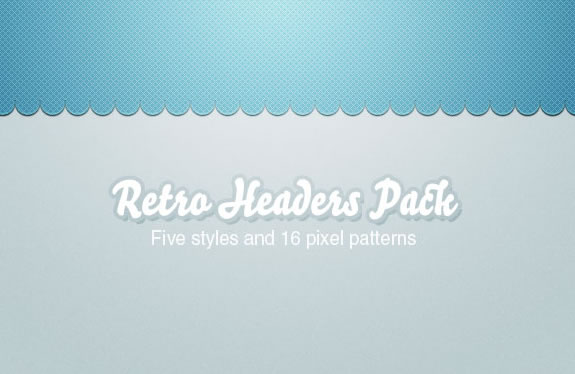
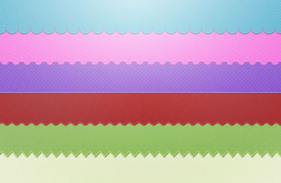
For our WDL Premium members, here’s a Retro Website Headers kit from WeGraphics containing 5 retro style website headers and 16 pixel patterns to match. These headers will definitely give your website the retro look you were waiting for, check it out!

Be sure to check out WeGraphics for more high-quality design resources, like vectors, brushes, textures, icons, and more.


wegraphics

Here’s a preview of the kit:

retrokit

retrokit

Download Retro Website Headers

Premium Member

You must be a WDL Premium member to download this file.

About this Partner

WeGraphicsWeGraphics is the definitive solution for designers who need high-quality resources but don’t want to be obliged to spend hundreds of dollars for them.


Here's some other articles that you will definitely find useful.

WDL Premium: Arabesque Vector Pack

WDL Premium: Texturize Photoshop Action Pack from Union Actions

WDL Premium: Guilloche Vector Pack


WDL Premium: Vintage Inspired Infographics

WDL Premium: Retro UI Set


Source:http://webdesignledger.com/premium/wdl-premium-retro-website-headers